Wednesday, 8 May 2013

Thursday, 25 April 2013


Wednesday, 24 April 2013
Finished
Today we officially finished out music magazine, I can't say it hasn't been stressful but I've tried my best and that's all I can. I now need to focus on my evaluations and thinking about how I can creatively present that.
Tuesday, 23 April 2013
One Day Left
Tomorrow is deadline day and I think I will be pretty much finished. I spent today finishing off editing my front cover photo and printing off my magazine pages to see what they look like and to see what is missing and what needs adding. Still need to do and a few touch ups and a grammar check of my article then it should all be finished and ready to hand in tomorrow!
Monday, 22 April 2013
Update
Only, 2 days left before the deadline is due. Today I managed to finally get a front cover photo and now I just need to do some final touches to my magazine and grammar checks. It's been a stressful few months!
Sunday, 21 April 2013
Double Page Spread Change


I decided to focus on my double page spread image today and the top photo is my original image and the bottom on is how I've used it in my article. I like the fact it brings feeling to the piece and that my artist is directly addressing the audience however I feel I may need a pull quote as there is too much space.
Friday, 19 April 2013
Contents Page

 After the photo shoot the other day I found this photo. I really liked it, as I thought it was emotional and I liked the background so I did some editing on Photoshop and inserted it into my contents page.
Thursday, 18 April 2013
Photoshoot
Today I re took some of my photos. I focused on the the background in particular and the facial expression of my artists. Out of all the photos I managed the pick out a picture for my double page spread and my contents page as I believe they my genre of music magazine.


Tuesday, 16 April 2013
Final Week
We have just over a week left before the deadline is due so to get myself organised I have planned my final week out to make sure I don't waste anytime and I can fully focus on the tasks ahead.

Saturday, 13 April 2013
Double Page Spread New

Wednesday, 10 April 2013
Contents Page New

Tuesday, 9 April 2013
Front Cover New
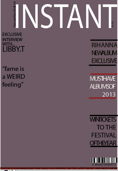
Monday, 8 April 2013
Layout
Saturday, 6 April 2013
Colour
I need focus on a diverse colour scheme as certain things need to be standing out more. I'm thinking for the front cover using black, purple and blue but focusing more on the blue as it doesn't seem to stand out. For the contents page and double page spread I think I need to add another colour as not enough things stand out within the several pages.
Thursday, 4 April 2013
Update
Today I came into college and worked on my magazine and summarised the things I need to work on. I've decided after looking at all my photos that I need to take my photos again. I need to add banners and colours as my magazine is missing them.
Monday, 1 April 2013
Feedback Analysis Double Page Spread
Now it's time for my final target audience analysis of my rough cut. These are the comments I got back when they evaluated my double page spread.
Positives
Positives
- Good distinction of fonts
- Subtle colour used for the type of magazine you are trying to create
- Nice signature of the artist to add a personal touch towards the magazine
- Good breakout boxes
- Nice quotes by the artist
- Go around the image of the guitar
- Missing punctuation and grammar in my article
- More colour needed- could possibly focus on the guitar colour
- Page details and branding of the magazine needed
Sunday, 31 March 2013
Feedback Analysis Contents Page
My target audience have evaluated each page for me after my rough to help enable I make the perfect magazine specifically targeted at them. This time they were analysing my contents page.
Positives
Positives
- Neat and well presented
- Nice font used on the contents page
- Very Clear
Improvements
- Addicted to the mid shot, need to change my shots
- More colour needed
- Variety of backgrounds needed on the photos
- Too much white space- use a bigger font to help fill in the gaps
- Make descriptions neater
Friday, 29 March 2013
Feedback Analysis Front Cover
After completing my rough cut I decided to get some feedback from my target audience and their personal opinion on my front cover. They told me what they liked and disliked about it.
Positives:
Positives:
- They liked the name of the magazine, and they thought it was appropriate for my genre.
- They liked the justifying I used to separate my articles.
- Background colour was good
- Good font used for the title of my magazine
Improvements: - More diverse fonts and colours for my stories
- Add more shapes and details to the magazine to add a personal touch
- Possibly could do with a bottom feature bar
- Change the front cover image needs to be cut
- Image needs to be more centered
- More articles and features needed
Wednesday, 27 March 2013
Rough Cuts
Today I finished my 3 rough cuts for my front cover, contents page and double page spread. I've found it very stressful but I have enjoyed it. The hardest part so far has to be the photos and Photoshop. Hopefully I will get some feedback to help improve my magazine.
Subscribe to:
Posts (Atom)