Preliminary Task Part 2...
From my next task i'm going to write up the codes and conventions of a contents page and explain how effective they are to an audience
Front Cover: Codes & Conventions
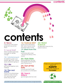
Fusion Magazine Contents Page

Spacing- This is a common layout technique used in contents magazine. Spacing is key to making your magazine look professional and it enables the reader to access information quickly. Everything tend to be in line with each other and looks smart. This contents page has used spacing as everything is equal to each and in line nothing looks out of place. When I create my magazine I will make sure the spacing is correct and everything looks in place.
Image- This images used within a contents page tend to reflect the rest of the magazine and the target audience. In this case an image of a tape is used to possibly show this magazine is aimed at a younger audience as they would be more interested with things associated with that.They often contain one bigger image to show the main story of the magazine. I will enable suitable images are used in magazine.
Colour- It's meant to represent the rest of the magazine. They generally tend to stick to 3 main colours as it looks like a common theme and it's a convention most companies stick too. This contents page has used pink and black and green as it's dominant colours suggesting it could be more aimed at girls. When it comes to making my magazine I will enable that the colours reflect the target market and that there isn't too many of them.
Titles- A convention of contents pages is that, they all include titles of each section of the magazine as it helps the audience and enables them to find what they are looking for. They headlines are often bold (like in this case) and stand out from this text underneath to make it easier for the reader. When creating my magazine I will make sure the titles of my articles are in bold and stand out at the audience.
Chronological Order- All contents pages have structure, they need some way to sort out all the articles from each, therefore the easiest way to do that is to arrange them in page order starting from the lowest. This way it adds structure to the magazine and allows it to make sense to the reader. In my magazine I will make sure that my contents is in order.
Text- The text is important when it comes to a contents page as bar the front cover it's the first thing to reader shall view. Therefore you need to give the audience some information about the type of things that are included within your magazine. Fusion give some extra information about each section of the magazine. Like news, festivals and weird science. They all relate back to the target audience of 15-19 year old. I will make sure I use the correct language when it comes to creating my magazine.
Font- Always an easy read font that isn't boring but it isn't illegible. Fusion and many other magazines tend to stick to just one or two fonts as it enables a common theme to run throughout the magazine. They often just use colours or the bold tool to stand out special information. For my contents page I will stick to a maximum of two fonts as it's an effective technique that increases audience consumption.
Background- The background of a contents page tend to stick to the common theme of the magazine. It tends to either be a plain image or in this case a in single colour. As this way it doesn't confuse the audience and it allows them to focus of the text and images, as the white brings out the text colours and the main image. Everything works together to make it an effective contents page. I will consider the background carefully when creating my contents page and enable it fits in with the rest of my magazine.


